Scholar Update: Ragini Siruguri
Ragini Siruguri, a 2023 Inlaks Scholar, is pursuing
her MA in Research in Typography and Graphic Communication
from the University of Reading. She is a visual communication designer
whose practice lies at the intersection of graphic design
and pedagogy, photography, books and writing.
Ragini has recently contributed to a fascinating book
on the weavers of the Rikhya community of Kutch.
We spoke with her to know more about the book,
her professional journey and plans going forward.
You’ve done the photography for a book ‘Weaving with Compassion: The Rikhyas of Kutch’, which has just been published. Can you tell us a bit about the book, and the experience of working on it?
‘Weaving with Compassion: the Rikhyas of Kutch’ is a book by Meera Goradia about the Meghwal weavers of Kutch in Gujarat. Based on conversations with weavers, it captures the philosophy and spiritual wisdom that guide the community’s craft practices. The author's voice forms the overarching narrative, while photographs give it a visual dimension. Published by Tara Books, this book is also the latest in their ‘Makers’ series, which explores some of India’s long standing hand-crafting traditions, such as pottery, boat-building and weaving.

‘Weaving with Compassion: the Rikhyas of Kutch’ by Meera Goradia, published by Tara Books.
I have worked as a book designer with Tara Books since 2016. I was part of some fantastic projects with the team, each of which gave me new insights on navigating the challenges of book design and production. My role in this project was two-fold: making the photographs, and creating a design system for the book’s layout. Some general aspects of the book such as the size and production methods were decided, but the structure of the text was complex, requiring multiple levels of typographic styling. Moreover, it could not be illustrated in the traditional sense, so the photographs needed to be metaphorical. The challenge was to come up with a flexible layout for the book, without knowing what the images might look like. A difficult task, but the team trusted me with the creative freedom to work this out.
In January 2023, Meera Goradia and I travelled around Kutch for over two weeks. She has worked extensively in the region, and the mutual admiration and warmth between her and the weavers was endearing. In hindsight, it was this trust that probably allowed them to welcome a stranger with a camera into their homes. I am not a professional photographer, but I use photography as a way to document the interaction of colour, texture, shape and pattern in different spaces and contexts. In this case, however, my approach to capturing images was through the lens of a book designer. They not only had to be well composed, but also had to adhere to a consistent visual language while staying relevant to the accompanying text. The layout was developed in a manner that tied these textual and visual narratives together to create a balanced reading experience.

Spreads from the book
The experience of working on this project brought a lot of insights, not just in envisioning a book project as a designer, but also in practising respect, sensitivity and discretion during our trip to Kutch. It is the stories of the weavers that make this book ‘quietly profound’, in the words of V Geetha, the editorial director at Tara Books. We hope that readers will enjoy discovering them as much as we enjoyed putting the book together.
Can you tell us about your experience studying at the University of Reading so far?

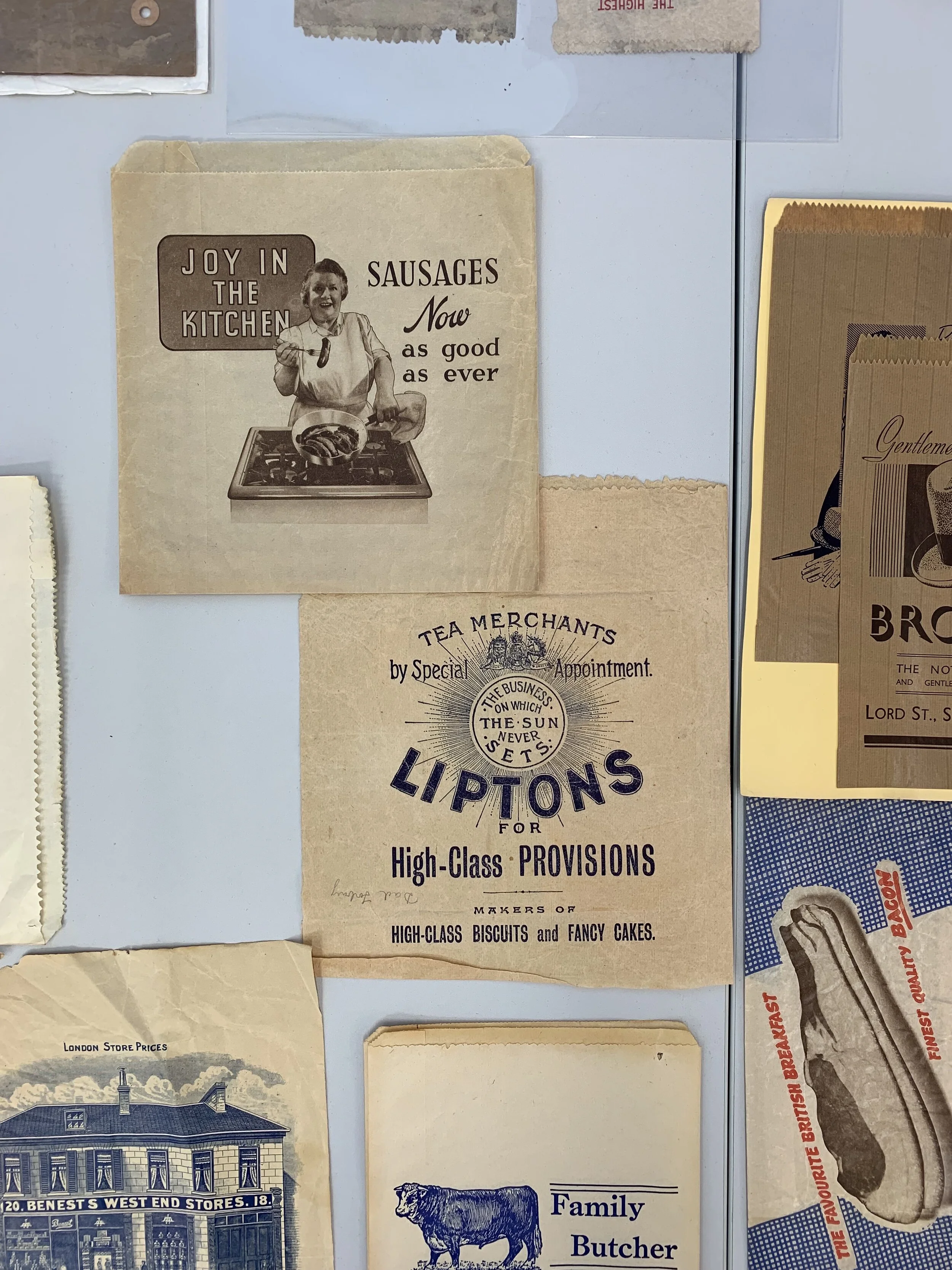
Shipper’s tickets from a printer’s catalogue in Manchester, early 20th century
My work with Tara Books, along with other opportunities and experiences over the years, have significantly altered my understanding of design and the role of the designer. These new perspectives brought forth several questions: how does one analyse the historical, political and cultural contexts of graphic design and typography produced in India, as has been done elsewhere? Why hadn’t I been introduced to such ways of seeing as an undergraduate design student in the country? To help further these inquiries, I looked for a formal course to hone my research and writing skills. In September 2023, with the support of the Inlaks scholarship, I began a research-based postgraduate course at the University of Reading in the United Kingdom.
Reading’s Department of Typography and Graphic Communication is tucked away in a corner of the university’s vast and beautiful campus. Though I have long admired the work of some of its staff and alumni, I was in awe of the range and magnitude of the projects within this modest building. Discovering historical archives and printing presses first hand and learning about past and current research projects has been incredibly inspiring. I was keen to explore the collections at the Department’s Centre for Ephemera Studies, and my first research project was subsequently on a catalogue of ‘shipper’s tickets.’ These colourful paper labels were designed in Manchester during the Indo-British cotton trade in the 19th century. Printed using a technique called chromolithography, they served the purpose of trademarks on bales of cotton that were shipped to India. The focus on visual content over textual matter on the labels was driven by an Indian market that may not have been familiar with reading the Latin script but was nevertheless visually literate. The imagery includes depictions of gods and goddesses; portraits of British royalty; icons of colonial power such as the Crown; and women in romanticised settings. It was fascinating to decipher and understand the interplay of worldwide events, developments in print technology and colonial ideologies that influenced the visual language of seemingly trivial paper objects. Driven by my enthusiasm, I travelled to Manchester over my term break to see the textiles exhibits at the Science and Industry Museum, which included a collection of shipper’s tickets, looms and other technology used in the cotton industry.
Being able to build on my understanding of craft, design, designers, and makers from multiple perspectives and across projects – from the handlooms of Kutch to the power looms of Manchester – has made this an invaluable experience.
You’ve expressed interest in contributing to the movement to make design more inclusive, accessible and rooted in the Indian aesthetic. Can you tell us why and how you’d like to focus your interests on this going forward?
In the Department at Reading, typography and typeface design are the subjects of many lectures, student seminars and conversations with mentors and classmates. Discussions range from the design of letterforms for world scripts and the styling of text for easy reading to the craft of printing with metal blocks that was the precursor of print and design technology as we know it in the 21st century. The Department’s Non-Latin Typeface Collection, particularly archival material relevant to South Asian scripts, has been of special interest to me. As a result, my research has moved towards understanding the history and evolution of typography and typeface design for Indian scripts.
Critical thinking forms an essential part of the Department’s research culture, and my mentors have encouraged me to examine how typography – itself a colonial import into India – has developed in the country in relation to global advancements in the field. India’s linguistic diversity provides a complex but extremely interesting context for the study, practice and teaching of typography. I am curious to investigate how identity, culture and politics have shaped our attitudes towards languages and scripts. How do these ideas trickle into the field of typography? Formal design education in India has been strongly influenced by West-centric design approaches, resulting in the underrepresentation of Indian scripts. But what would a pluralistic approach to typography and type design education in India look like?
As for my future directions, I see myself studying more closely how, and by whom, typography and typeface design for Indian scripts has happened in the country. While my research projects within this course are a very small step towards understanding the larger picture, my objective is to make the most of my time, resources, and guidance from my mentors at the Department. Most of all, I am thrilled to find my place in such a diverse and passionate community of researchers, educators and designers. I have most definitely been bitten by the research bug and look forward to exploring my ideas through independent and collaborative projects in India.
Images of ‘Weaving with Compassion’ are courtesy of Divya Vijayakumar and Tara Books. To buy a copy, visit tarabooks.com
Images of shipper’s tickets are from the Centre for Ephemera Studies, Lettering, Printing and Graphic Design Collections at the Department of Typography and Graphic Communication, University of Reading.