Alumnus Update: Aadarsh Rajan
Aadarsh Rajan is a 2018 scholar who pursued an MA in Research in Typography and Graphic Communication at the University of Reading.
This week he shares with us the joy as well as the social, political and economic significances that surround type-making.
If you ever saw a type-designer at work you’d witness the screen pulse as they zoom in to view details that on paper might be scarcely wider than an mm, and zoom out, until letters are nothing but texture. It is a slow, elongated process—that may last years even—to craft something that is so useful and ubiquitous and yet very mundane: a typeface, or as it is known colloquially, a font.
Typefaces are built one character at a time. Every point, line and curve deliberated upon. Yet the design of each character is in service of the whole: letters, numbers and the accompanying typographic furniture. The goal is twofold: making sure the font is functional—for a font ought to be readable—and imbuing it with a certain je ne sais quoi, for therein lies the joy of practicing the craft. Why else would we design new fonts… or anything?
Department of Typography and Graphic Communication at the University of Reading
I had fallen in love with type-design in my final year at NID and ever since had managed to spin a career around designing Tamil letters. However, by spring 2018, as my career careened into adolescence, my interest shifted, zooming out from letters onto the larger context of the craft and the profession. The scholarship from the Inlaks Shivdasani Foundation allowed me to pursue this line of inquiry at the Department of Typography and Graphic Communication at the University of Reading.
The Department is an interdisciplinary space where type serves as a nexus (no, there is no finger wagging against the use of comic sans here). Here typefaces are things to be built and tools to create. But they are also material artefacts with histories and futures. Here, type became a means to glimpse at the social, economic and political realities that surround the production of all printed matter as well as clues to understand the zeitgeist. And there was a certain joy to being steered through the fertile collections of the department by faculty that are just as steeped in history as they are versed in the current.
As an MRes student, I shared classes with the good folks from the Type-Design and Book Design streams, attending workshops on design as well as lectures on history and theory. On occasion we convened with doctoral students and research fellows to understand the state of research in typography and learn from their process. The field of research in typography, being relatively young, brims with possibilities for original work and at every turn we were encouraged to explore its frontiers. Roads were aplenty, each untraveled.
I used each assignment to broaden my own palette for research. Topics ranged from a history of Dalits in Indian print culture, to an essay on the legacy of Donald Knuth’s ingenious Metafont, to an analysis of the minutiae of typography in instructional books. Eventually for the subject of my final thesis I’d cast my lens inwards to interrogate the profession of Design itself, specifically in the Indian context.
Despite being equipped with a broadened panorama of ideas and resources, I found myself succumb to the naïveté of ambition. An introspective critique of the profession is nothing new, and there is a line that distinguishes a careful analysis from a rolling rant. But rather than dismiss my enthusiasm as a lark, my mentors, Gerry Leonidas and Fiona Ross, urged me to sharpen my scope. At first this seemed antithetical to the purpose of my Masters—to broaden my view—but I realised that academic research was less about answers than it was about asking the right questions.
To better comprehend the profession of design, my thesis investigated the role of DeskTop Publishing (DTP) operators within the design discourse. Despite outnumbering ‘qualified designers’, DTP operators remain peripheral to the design canon. But the margins seemed the perfect vantage point to apprehend this monoculture. The popular discourse was analysed through a survey of three key documents: government occupational standards, advertised brochures and classroom content from unaccredited training institutes. The aim being, to borrow from Carver, understanding what we talk about when we talk about design.
Unaccredited Training Institutes
At the heart of the popular discourse lay the oft-cited distinction between knowledge and skill where ‘thinking’ and ‘doing’ are believed to be separate and antithetical aspects of any creative action. Implicit is the belief that those who ‘think’ are superior to those who ‘merely do’. An important correlation: graduates from accredited universities are assumed to ‘think’ while DTP operators are relegated to being mere operators. However, Marx, Anand Teltumbde and Andrew Abbott interpret a different reality. Baked into the distinction between knowledge and skill is a notion of socio-economic class. Despite evidence of a knowledge embodied within the skill, DTP operators are deemed as ‘not real’ designers, only because they belong to or work for a class outside of the cultural elite, or at most work ‘in service’ of the elite.
As I combed through the documents, analysing the discourse word by word, I was surprised to find myself refining and adjusting the contours of my brief. A self-reflexive habit imbibed. Writing became a tool to think, not a consequence of it. This realisation an echo of my own thesis.
More importantly, as I deliberated upon the construction of each argument, restructuring my thesis draft after draft, I realised that research was much like type-design. A dancing shift between the specific and the whole. I’d realised that when it came to type-design what I’d been smitten by was not an exercise in visual form but the knowledge embodied in practice and a quality of attention to the granular. Skills my Masters helped translate to my practice as a researcher.
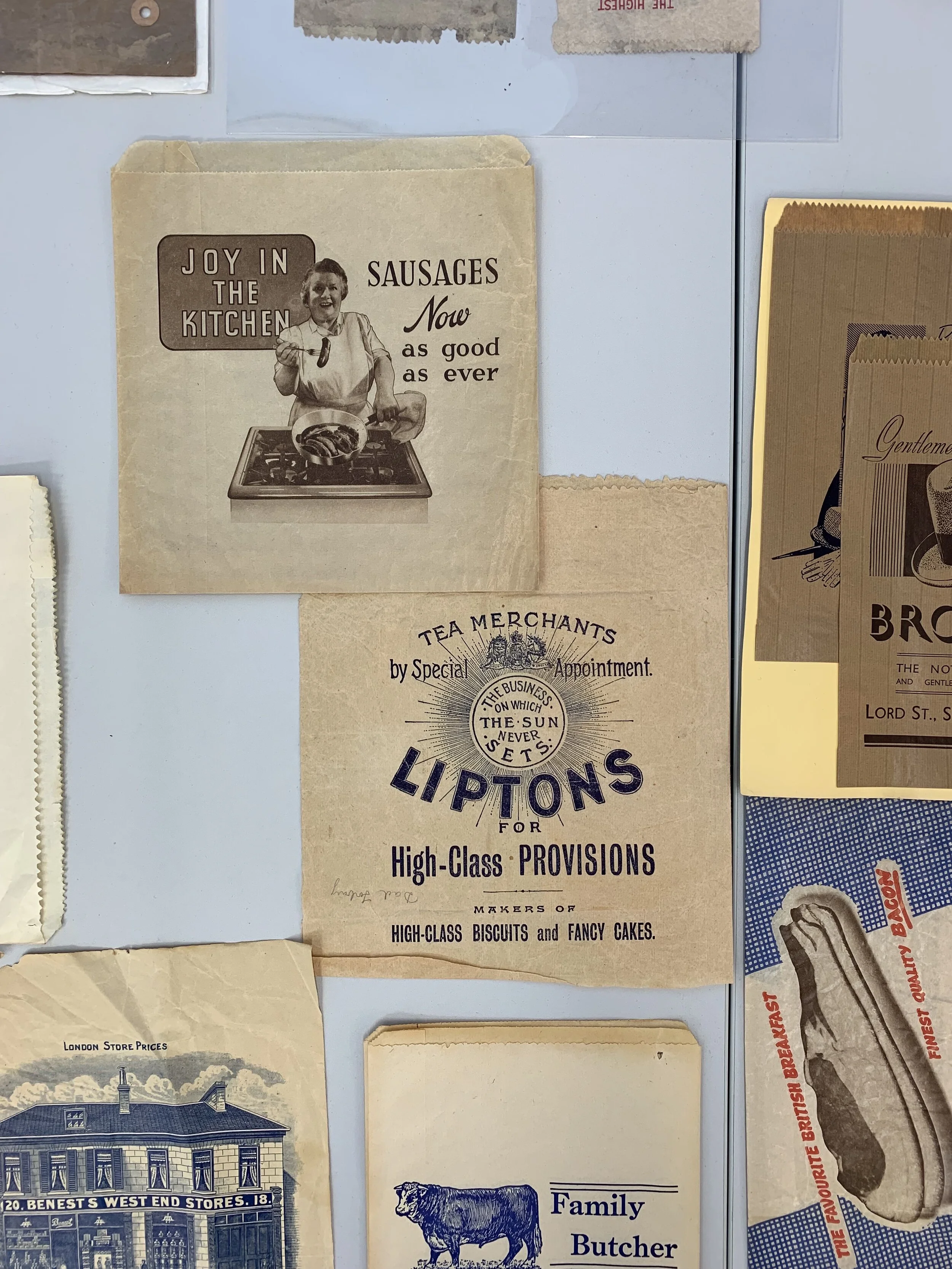
Cover Image: Printing Efflorescence at the Department


